Welcome to Bene! This project entails a brand identity, which was developed through a graphic design course at the University of Cincinnati.
INTENTION STATEMENT
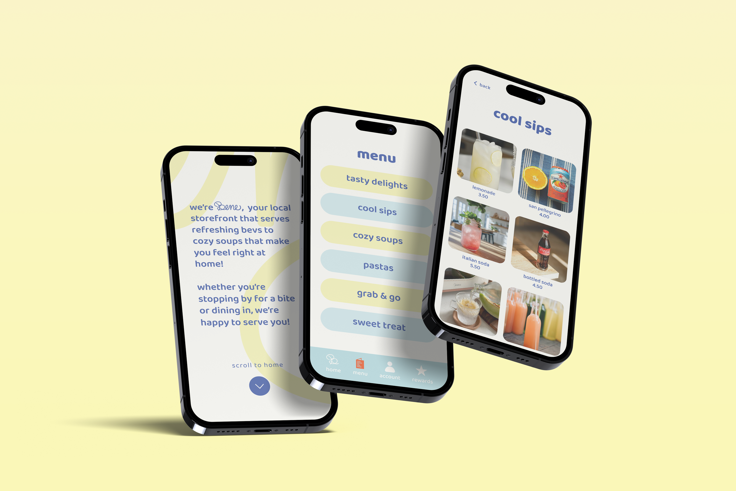
Welcome to Bene! Bene is your local, Italian-inspired restaurant that serves refreshing beverages and delicious soups that make you feel right at home. We are located in Rhode Island, Virginia. Our customers can choose to stay and enjoy the space or take their items to go. Alongside our storefront, you can download our app, ‘bene eats’, where you can learn more about bene’s mission and community values and see all of the tasty drinks and dishes we serve.
END DESIGNS
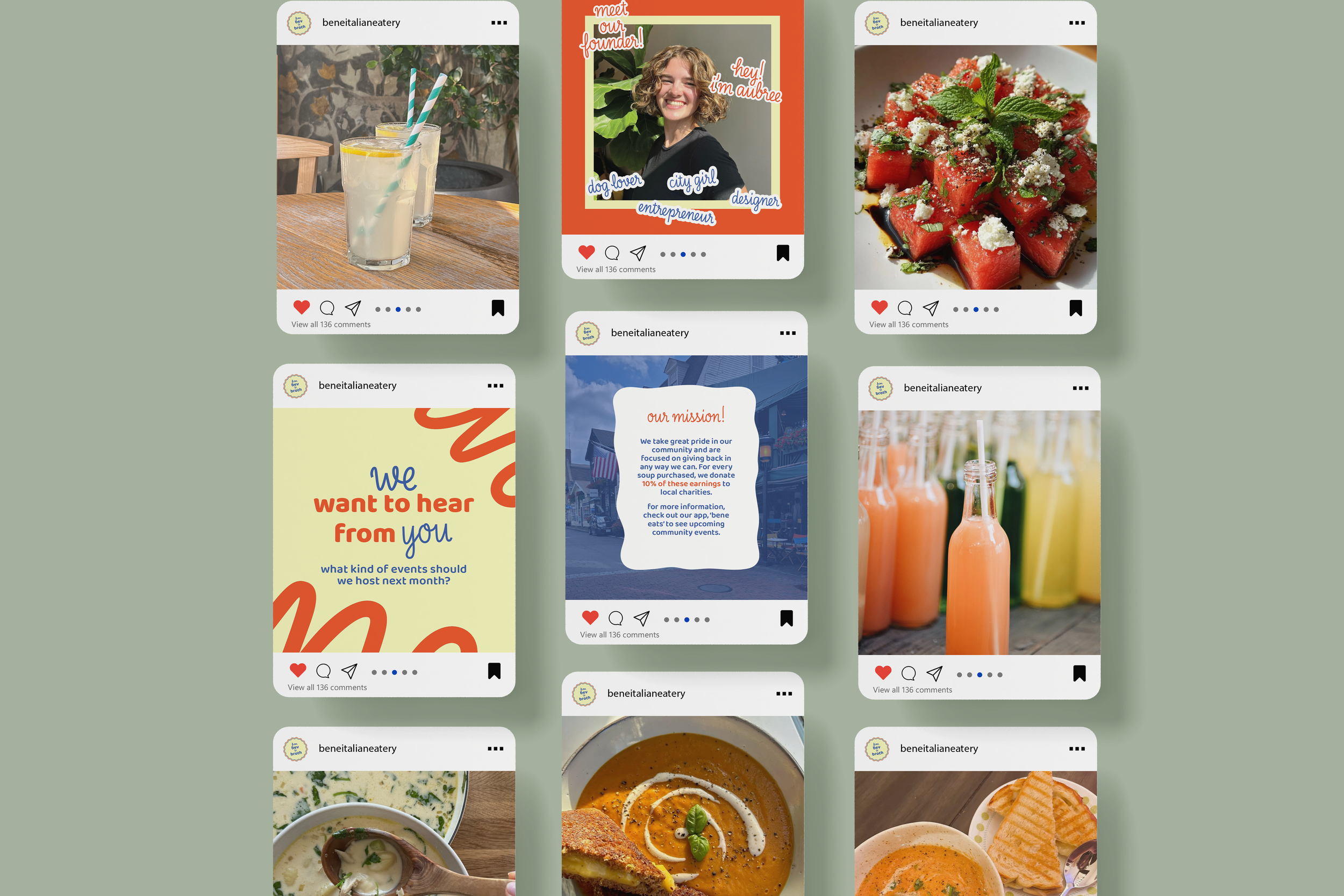
Bene uses marketing materials that help support its brand awareness. A key focus of this project was the development of the wordmark and large-scale menu. Also represented through this page are its social media accounts, which share new menu items, updates, and a beautiful image gallery. Following this, our mobile app for customers is available for download.
Building the Vision
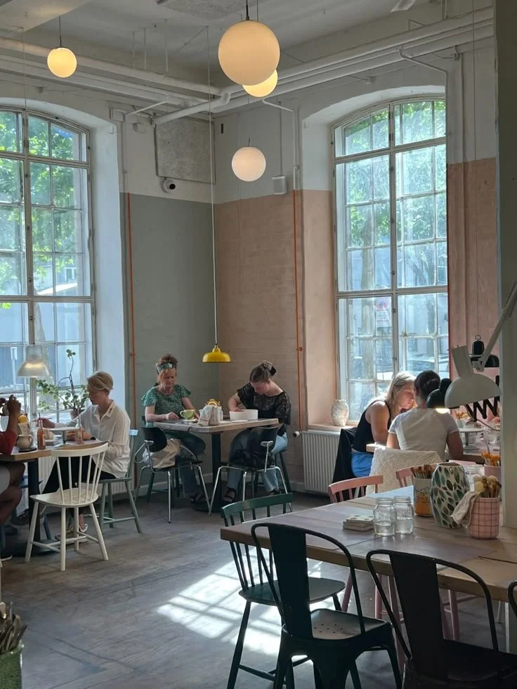
In building the brand, I envisioned Bene as a local and welcoming eatery, a place with a warm atmosphere where people could share a drink, catch up, or find a cozy little nook to get some work done. I imagine the storefront's aesthetics to be earthy, with warm colors, wood, subway tile, and tons of natural lighting. Something also important to note is the seating. I envisioned plenty of room, as we are a place that loves our community, and we try our best to be inclusive and accessible.


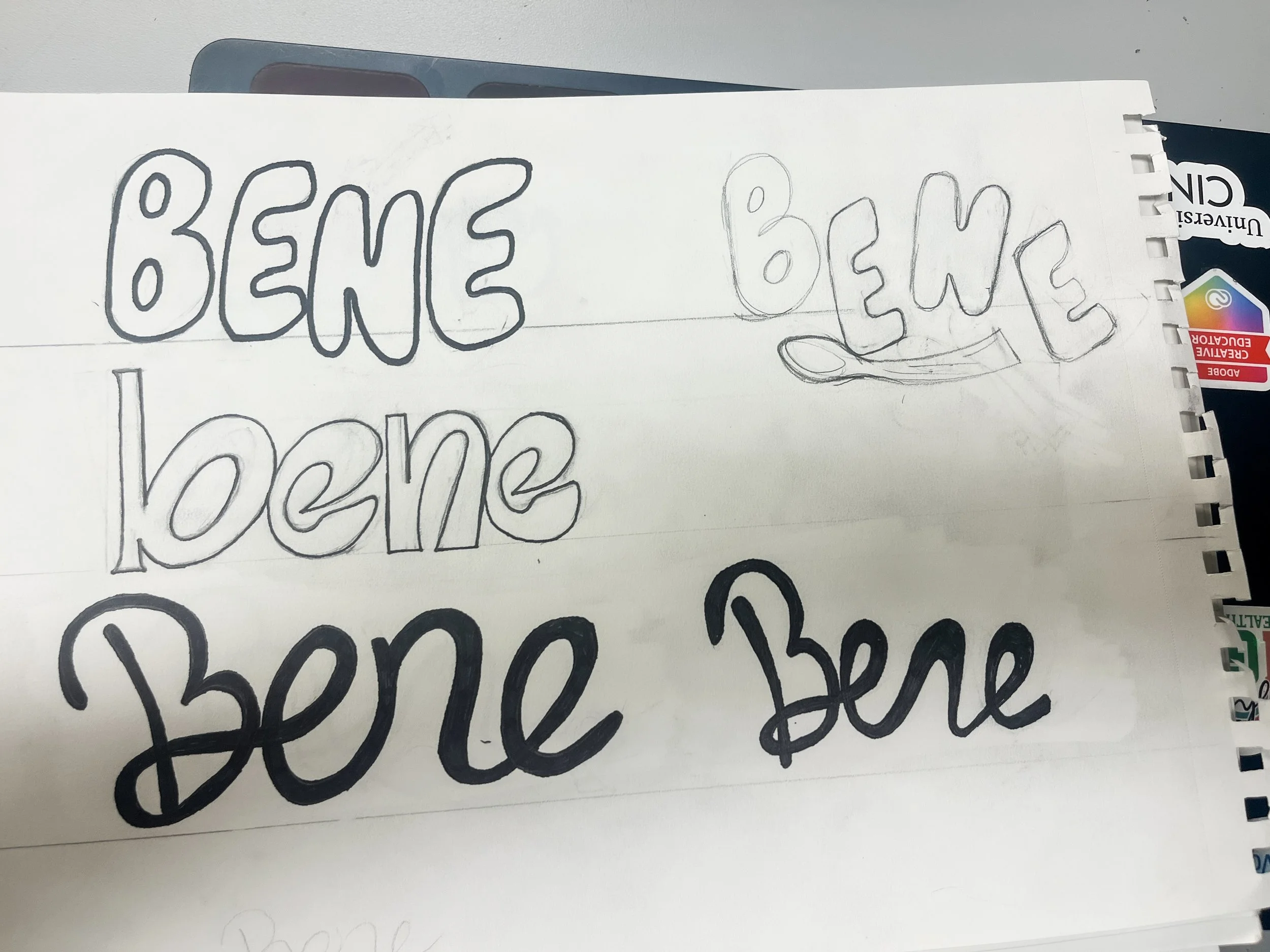
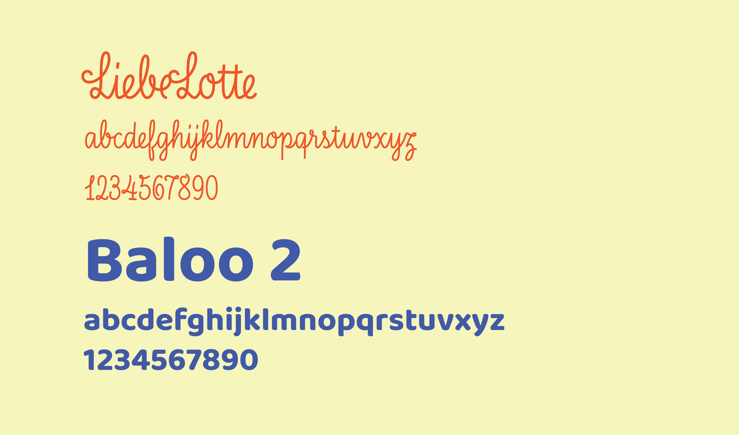
Wordmark + Touchpoint Process
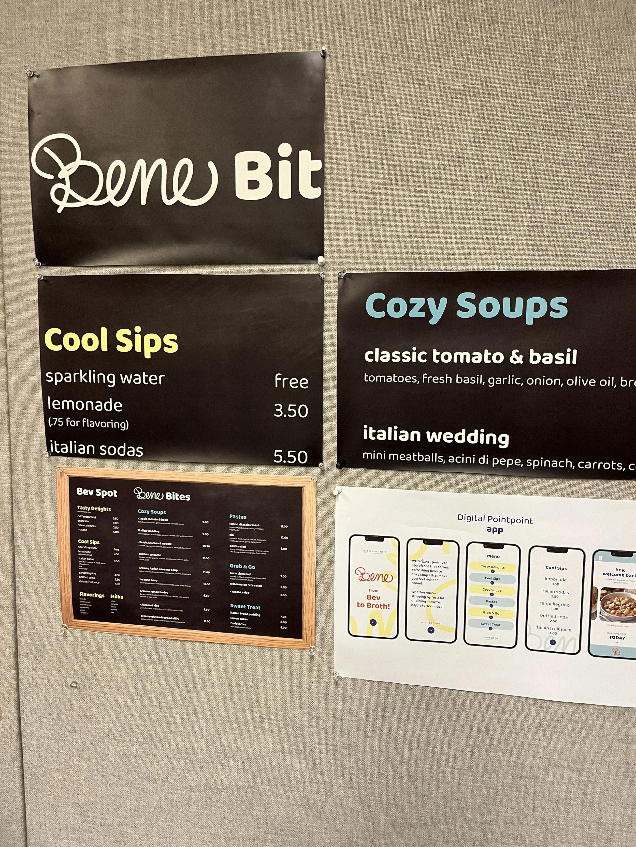
Below shows a glimpse into the variations that made up the wordmark process. I experimented with script type to rounded letters that give a warm and friendly Italian feel. The second image shows close-ups of my menu in full scale versus the menu in its entirety. Below is an earlier version of my second touchpoint, which is a mobile app. (This is not the final version.)
Brand Content
Bene is built on community, authenticity, and connection. To reflect that, I chose bright and warm colors that feel positive and inviting. The typography remains friendly and versatile across mediums, while the script wordmark highlights our cole values of connectivity which is subtly echoed throughout the app. Below are the core branding assets that define Bene: the primary wordmark, a vibrant color palette, and our typography in use.
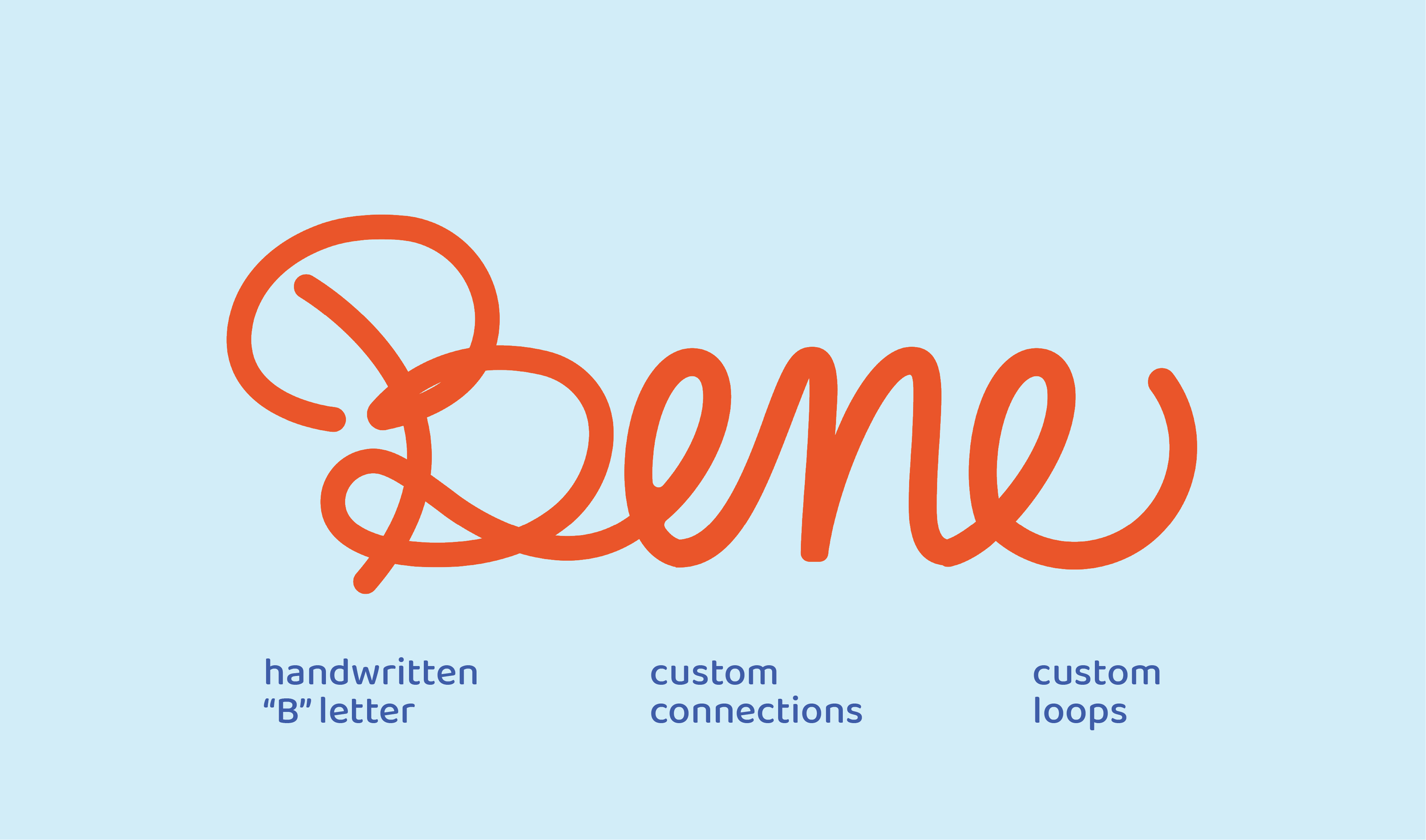
Wordmark
Typography Applied
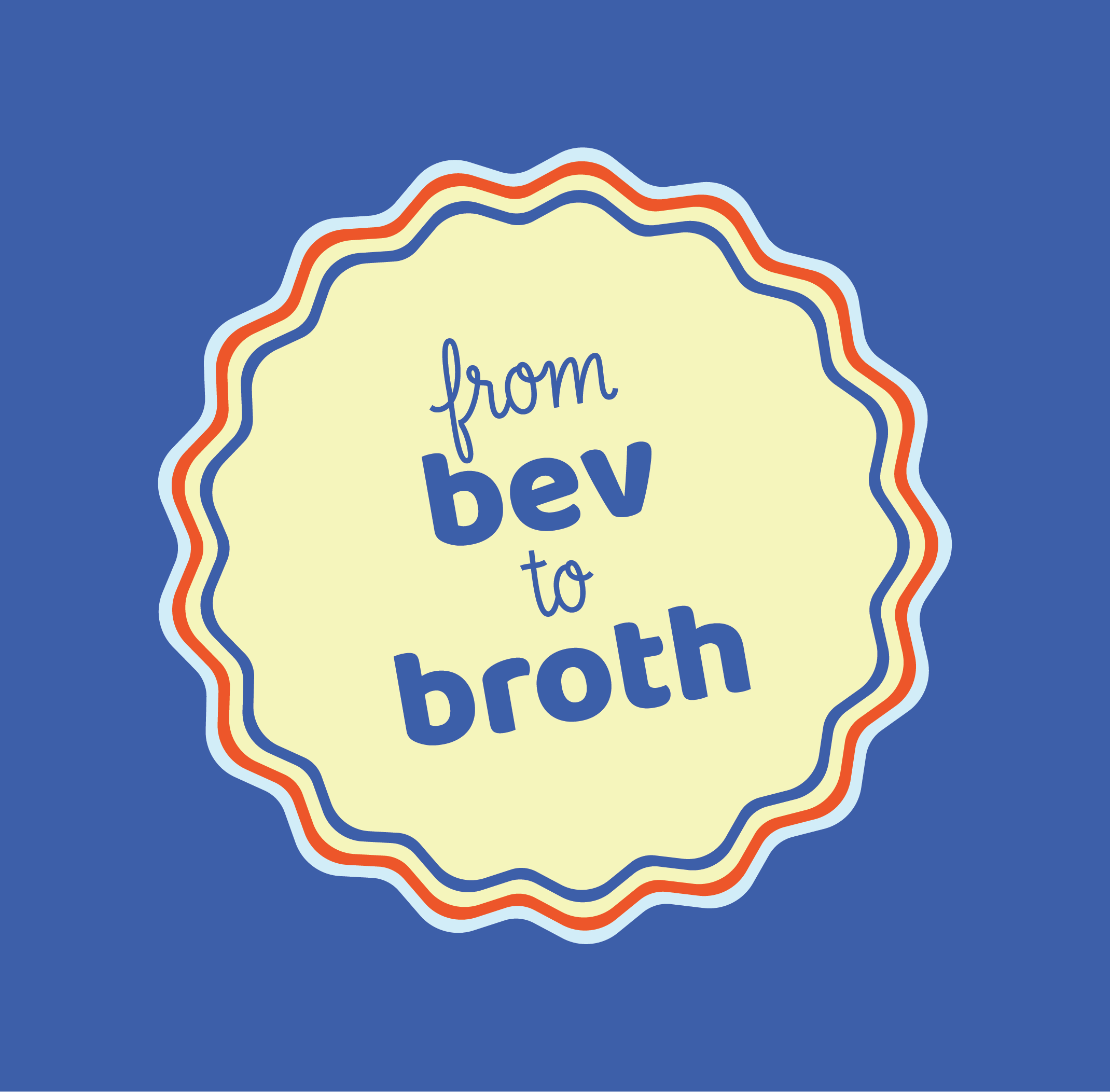
Slogan + Mobile Icon
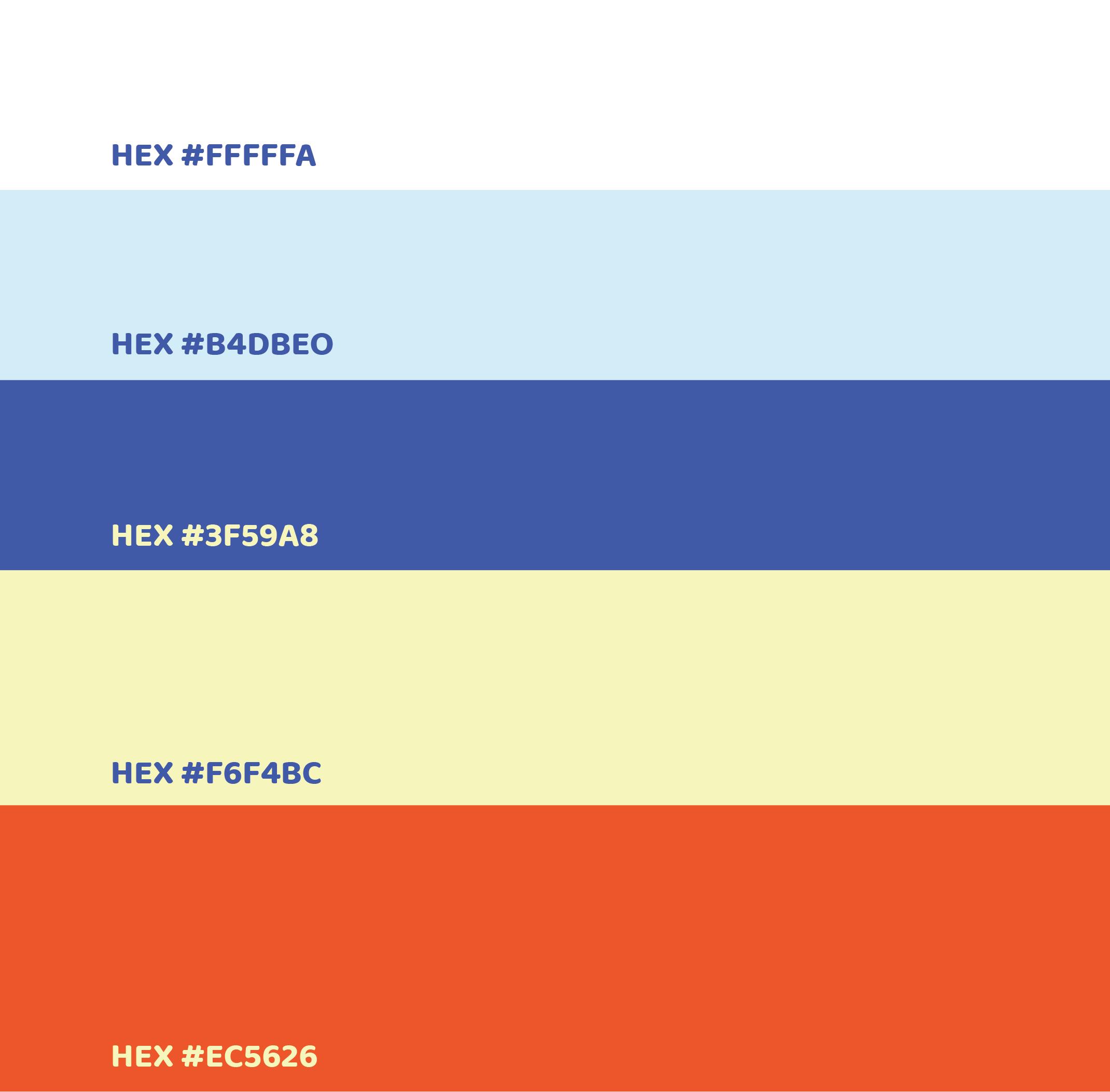
Color Usage
In-Store Menu Signage
A key focus of this project was designing a menu that reflected Bene’s character. From the beginning, I envisioned it as a large, eye-catching piece, something you’d notice the moment you walk in. Its handwritten feel ties back to our wordmark and reinforces the inviting, playful spirit of the brand. The menu embodies the fun, approachable energy.

Social Media Signage + Mobile App
You can find us online at @beneitalianeatery. Through here, you can keep up with our social pages or reach out to us if you have any questions. We also offer a mobile app that shares pieces of our menu, allowing guests to browse ahead of time. We value in-person, local experience, so we have decided to keep ordering just in-store. This being said, with every purchase, guests can earn points, either through our mobile app or a handout punch card, to earn some fun merch/coupons.